Fantastic Voyage - Final Animation Process and Rendered Sets
The Process
I decided to recycle my previz for my final animation as it held lots of strengths as its own piece of work. This helped save time building new sets and creating new cameras. Creating the final animation was a case of polishing-up existing material and adding proper textures. I set about fixing the aspect ratio (1920 x 1080) and the fps (25fps). I was very concerned over the crashing issue I had with my Previz process, which would happen each time I used smooth preview. Luckily, I found a solution that let me play blast my final animation in full quality which involved changing the render engine from 'OpenGL' to 'DX11'.
for the opening shot, I realised I needed an additional tree texture, one without the spray-painted 'X', as this is painted onto the tree in a later scene.
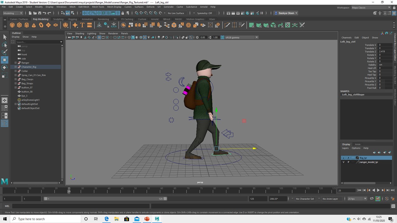
once the scene was properly textured, I attempted to create a proper walking animation for my ranger character...which looked more like a limp. I found that creating a walk cycle within the scene was a challenge and therefore used Alan's walk video tutorial in the ranger models own project file. This was far more successful. I created a single walk cycle which lasted 25 frames, and then looped the motion using the graph editor and 'pre/post infinity'.
The outcome is stiff, but it communicates a walking action. This character is relatively insignificant and only visible for a short period of my animation. I therefore didn't pay this motion too much attention. By cycling the same motion, I was able to create a more symmetrical and rhythmic walk, which my first attempt completely lacked. I used the model's master control to tie the motion back into the scene.
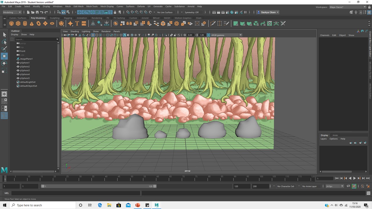
I replaced the polygon shapes (seen in my previz) with proper rock models. I created a quick texture using the same colour scheme as the matte painting and a rock texture from 'texture.com' by overlaying the image in photoshop. I also created a bump map for a more complex surface. I found that remodelling this prop helped elevate the entire composition.
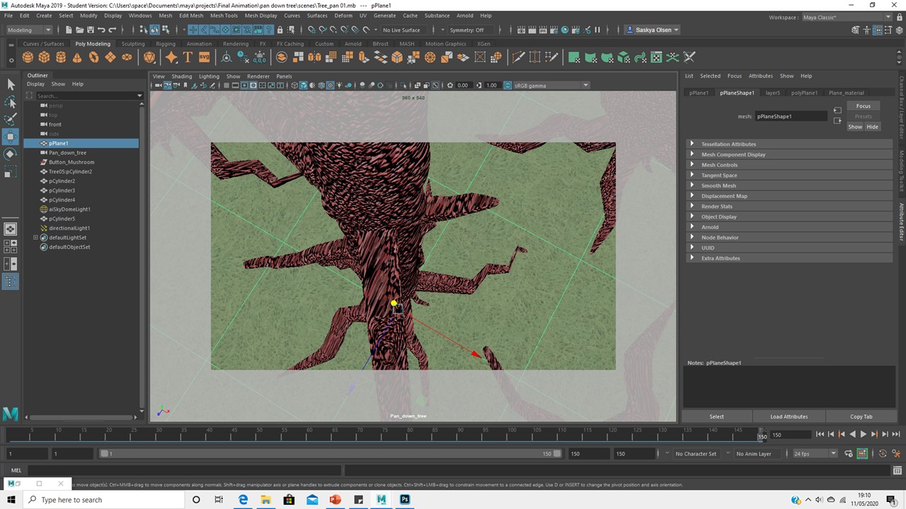
As I worked on the third shot of the animation, I decided to adjust the texture of the tree; the pink toned wood and shiny surface created a 'fleshy' effect that I found distracting. I went back into photoshop and changed the pink into a rich brown, which also compliments the yellow spray painted 'X' much better. I also reduced the texture's specular and toned down the bump map. I was glad to have made this adjustment once it was done.
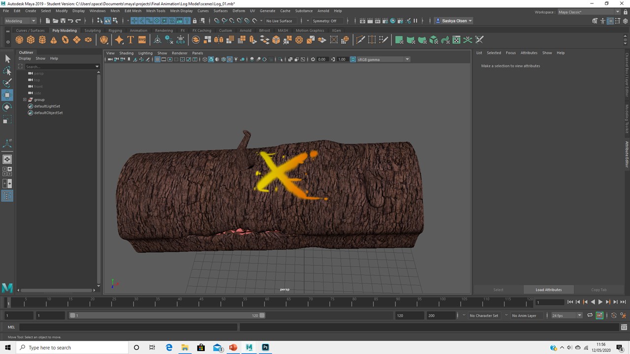
Creating the previz made me realise I had missed some important models, such as a log for my mushroom to sit and grow on. For my final animation, I developed the log I modelled for the previz by adjusting its geometry and UV mapping the model in order to give it a personalised texture. I re-used the original tree texture in order to suggest that this log derives from the tree that is cut down in a previous scene.
Progressing through my animation, I realised that I had to use my walking character again. This time, the character walks and stops in front of the camera. I was unsure how to animate this, as I had looped the walking motion and couldn't get the character to stop. I was able to get help from Simon, who taught me how to 'bake' an animation. This allowed me to discard the frames I didn't need and create an ease-out animation as the ranger stops in front of the camera. I developed on this scene further by including 'blinking', which I accidentally included in my previz.
Adding textures really brought the scenes to life. Despite the shots being playblasted rather than properly rendered, I still think the simple lighting helps elevate the scenes and create well-needed depth.
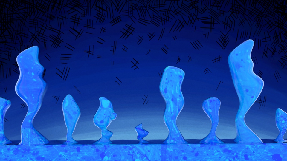
As I worked through my animation, I would always use Arnold render view to get an idea of the scene's final look. For my hyphae models, I paid special attention to Arnold as I wanted these models to have a unique texture. By experimenting with the 'thin film' attribute and its IOR, I was able to create an interesting coating over the blue texture. I was impressed at how this material interacted with the scenes lighting.
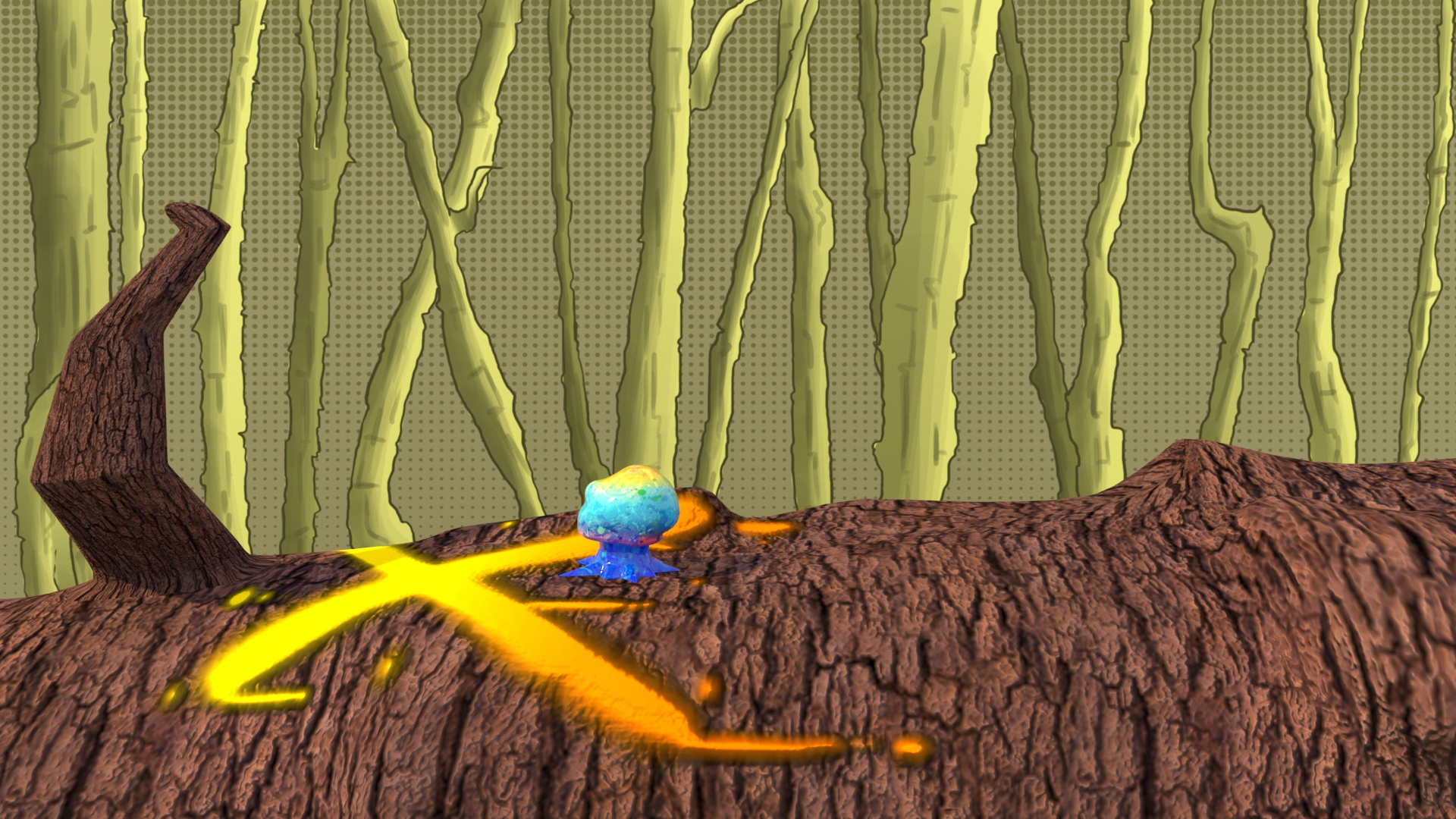
The 'flat' effect of my matte paintings within compositions was deliberate, as it emphasises themes of comic books and graphic novels. However, I sometimes wanted a little more dimension. In this scene, I adjusted the matte painting by adding geometry. Th outcome appears as though the camera is peering out of the log and onto the forest understory. I used lots of directional lights to give the impression of sunlight streaming in.
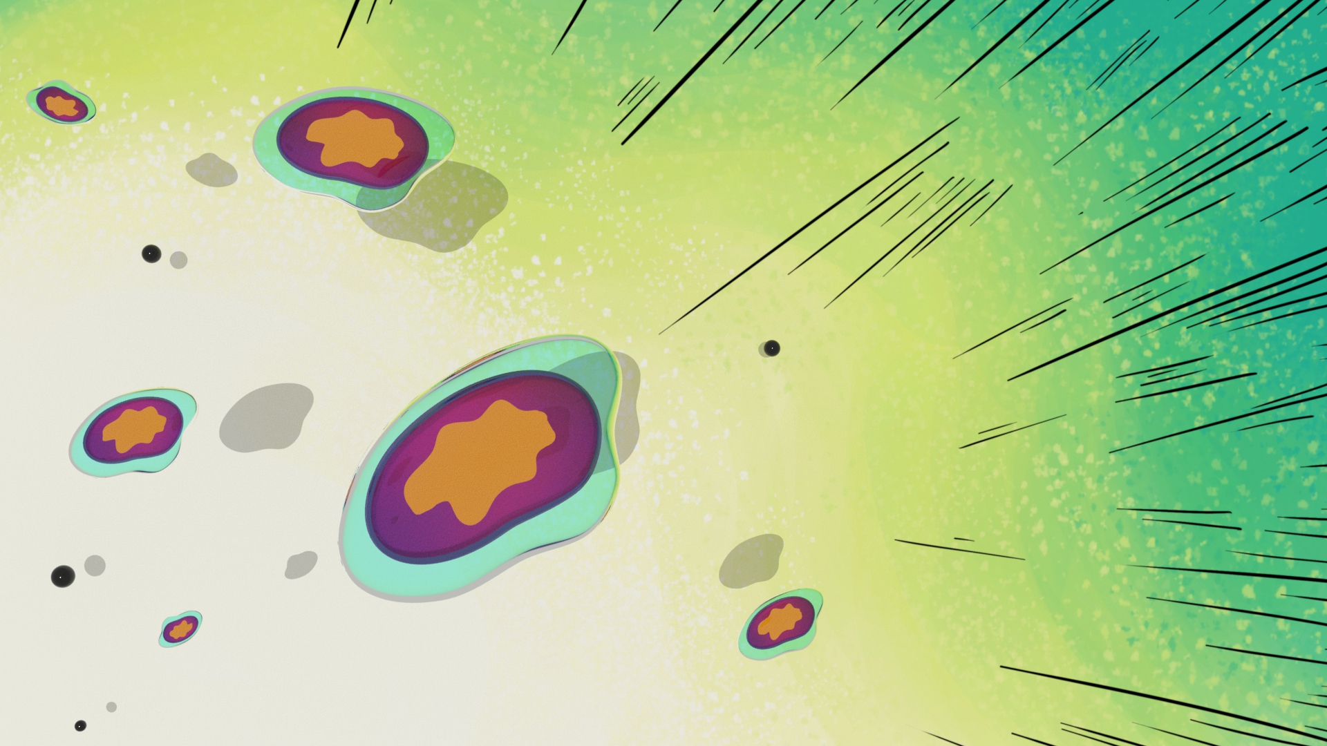
Once each shot was developed, polished and included proper animation, I playblasted the scenes and imported them into Premier Pro. I really liked the flow and continuity of the finished previz, so I used that video as a template for editing this final animation. I also used the same sound effects that I had edited for my previz. I applied similar typography to the project as well, but developed on the 2D animations, which looked scruffy in the previz. I think that the 'nuclei fusion' looks better and also communicates its scientific principles better than the previz draft.
Rendered Sets
 |
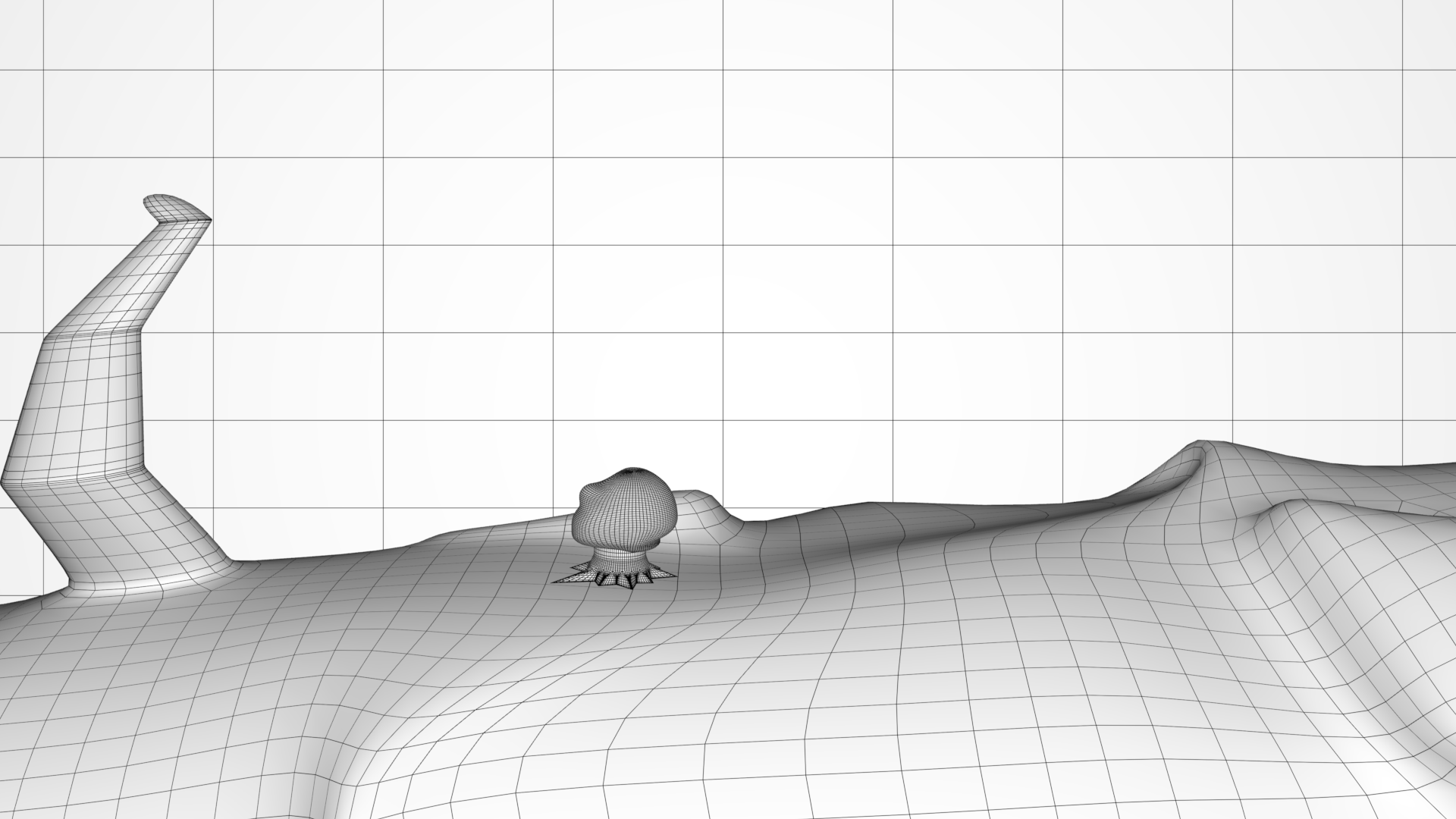
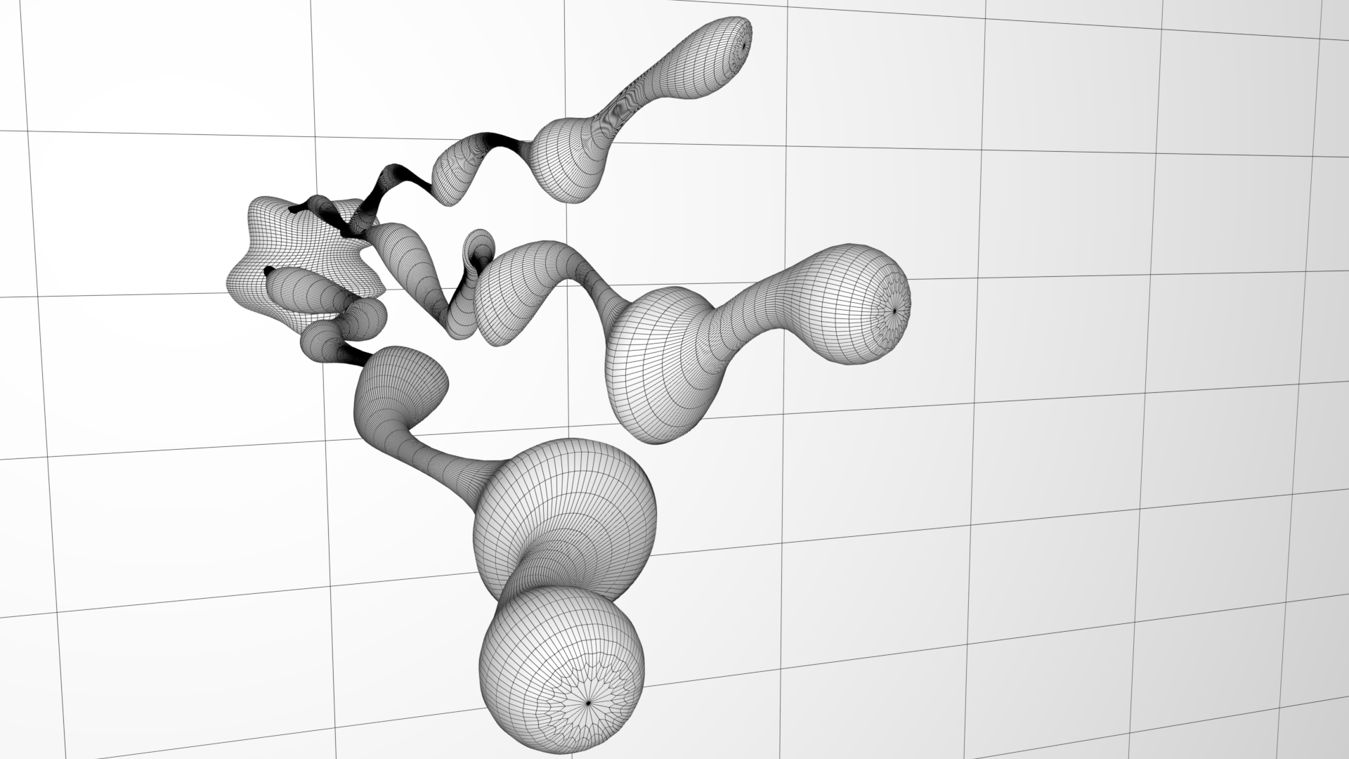
Wireframe Sets
Lighting Experiments
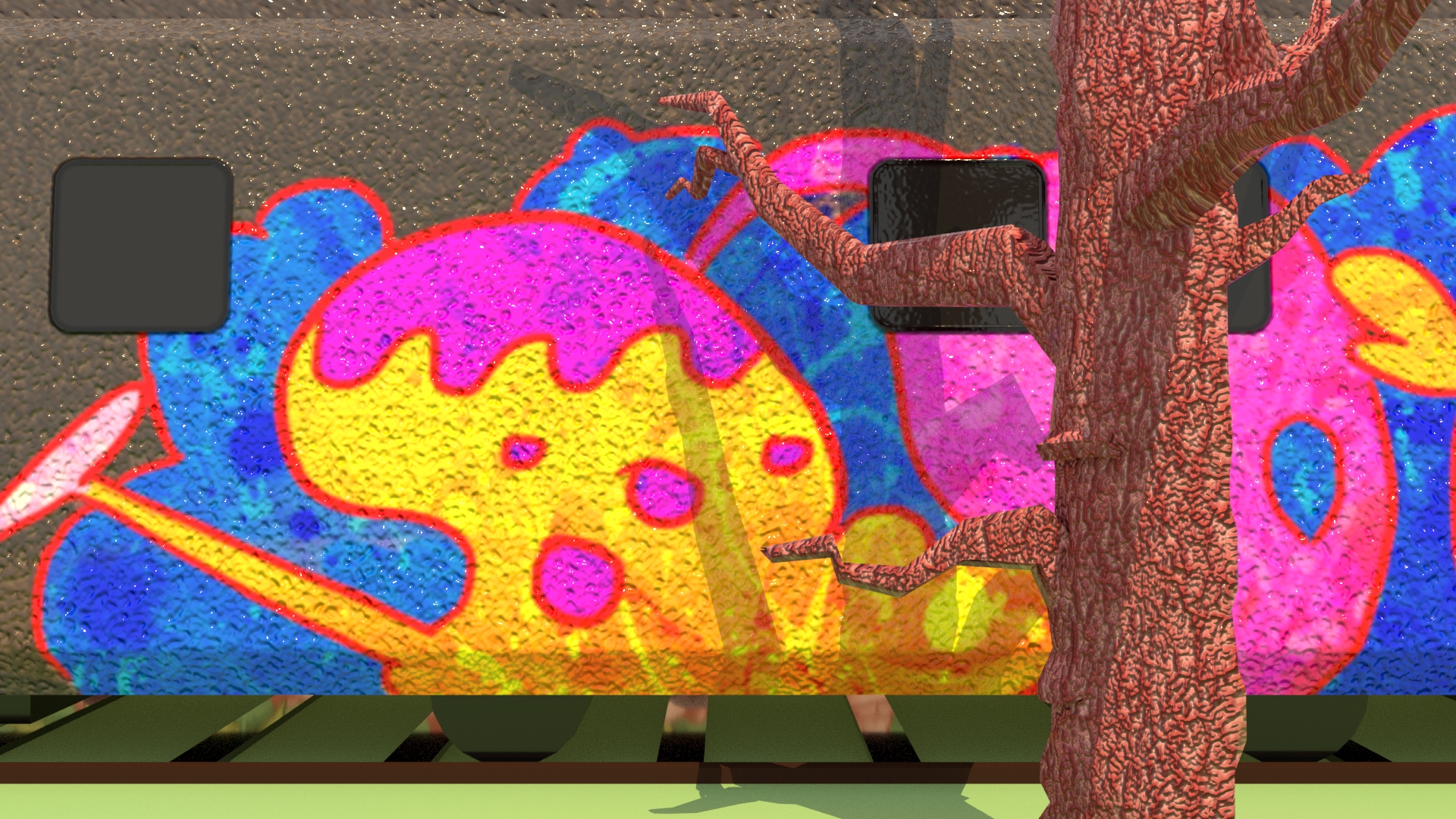
Developing on from the Maya Lighting Masterclass I attended, I decided to explore the lighting capabilities of Autodesk Maya. I'm still unfamiliar with some of the attributes at my disposal, so I stuck to the settings I was familiar with. I found that coupling an 'Arnold Sky dome Light' and a 'Maya Directional Light' was the easiest to manipulate, this infusion was also effective at atmosphere. In order to maintain a decent resolution of my rendered snapshots, I increased the 'samples' of a light along with its 'exposure'.













Comments