
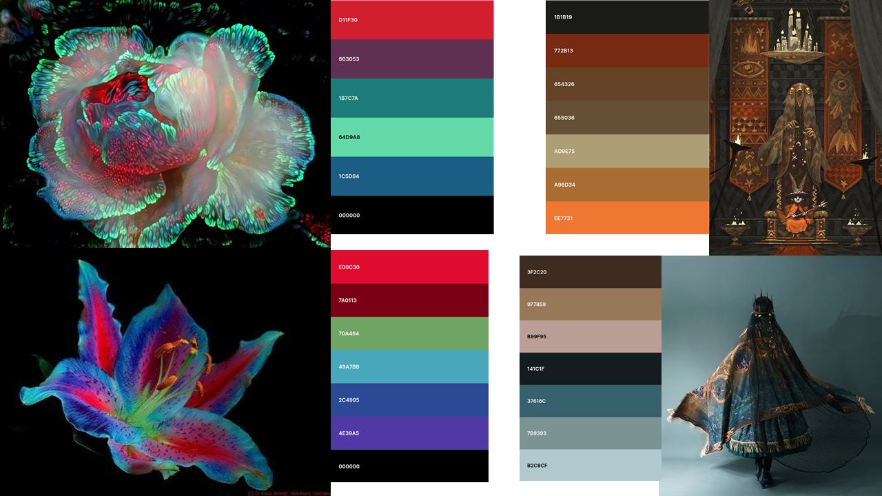
Premise: Angela Sung & Colour Experimentation
 |
During the February vertex event, Angela Sung presented a colour masterclass, exhibiting her abstract yet logical use of colour. I arrived to the event with limited knowledge of colour theory, and struggled to understand her working process. I couldn't understand her colour choices and I found myself lost in colours within an isolated area of a composition.
Angela discussed how subtle colour shifts are enough to infer detail, when used correctly. The fundamental rule of her work involves the relationship between warm and cool colours. Warmth within yellows and reds is ideal for highlights, whereas blues and purples are best for shadows. Adjusting the tones of these basic colours are what suggest detail, depth and dimension. This was all revealed within examples of her own work, which was void of line art or greyscale and just focused on shifts in colour.
 |
| Above, Gouache painting by Angela Sung when small areas of the painting are isolated, it's hard to grasp Angela's colour choices. When viewed as a whole, the image focuses on warm highlights and cool shadows. Angela has through knowledge on the personality of natural light and how this reacts with different materials. For the above piece, black or white is never used, only deep blues and bright yellows, pinks and oranges. |
 |
| Above, a colour wheel. The paring of colours changes their behaviour. |
Colour Schemes:
- A Monochromatic colour scheme uses one colour in various shades or tones. This creates a soothing effect and is easy on the eyes, because the colours naturally harmonise.

- An Analogous colour scheme uses a few related colours, such as blues and greens which are near each other on the colour wheel. One colour is dominant and the others support. The slight variation within this colour scheme creates an enriching appeal.

- A Complimentary colour scheme consists of contrasting colours, such as green and red. This scheme attracts attention and is ideal for suggesting light and shadow. There's many examples of complimentary colour schemes in Angela Sung's painting, above.

Applying Colour Theory to my Premise Project:
 |
| Gouache Paint Study by Saskya Olsen Above, a Gouache paint study of a Premise character under development. Angela Sung expressed her love for gouache paints during her Vertex panel, which allowed her to practice colour interaction. I therefore decided to begin learning Gouache paints myself. Although subtle, I've tried to use complimentary colours in this piece to suggest lights and shadows. This can be seen by the purples and yellows on skin tones, and the purples, greens and yellows on the characters scarf. Within the black feathered clothing, I tried to incorporate dark blues, greens and purples to still infer light and shadow on a light -absorbing material. |
Colour Mood Boards:

Comments