Starting the CG Pre-Visualisation Process - Building sets
Before starting any modelling, I decided to draw-out some architectural plans...


I decided to add some simple roofing to my community centre, as I think the light will cast some effective shadows, adding a bit of dimension and detail to my structure. This also helps to break up sharp lines.

When colouring my structure, I aimed for low saturated, boring and realistic colours, as this matches the themes of my mockumentary.

For the windows and prism skylights, I used a slightly transparent material, a subtle way of splitting up the boring block colours used throughout.


I used the 'chicken coop' plane I created in a previous Maya tutorial to create a base for my shot. A basic green plane looked extremely bland, and the structure was swallowed up by the flatness. This plane is a little more effective.

Once the set was complete, I began adjusting the camera. When looking through the shot, I decided to add some trees (also from the chicken coop tutorial) to add some levelling and background interest. The trees also give the building a more realistic sense of scale. I used the tools I had learnt from my pre-visualisation workshops to key-frame the camera in two different positions (frames 1 and 96 for 4 seconds of footage). I then play blasted the clip as an MP4, a format I will be using for my other completed play blasted shots.

I then began working on the second shot of my mockumentary. This uses the same scene model as the previous shot, so I simply set up another camera. I now need to consider characters. I hope to use the standard pre-set downloadable files and edit their appearances at a later date.


Similarly to the first shot I created, I used the graph editor to create a linear and constant camera movement.

I decorated the set-up camera with some rocks in the moving water, the camera will move past these.


For this set, I focused on decoration, making the interior look like a 'community centre'. I decided to incorporate the blue of the uniforms and made it a reoccurring theme in this reception room. The blue rugs and worktop tie with the light blue walls.

I discovered the 'type' tool under the 'create' menu, and used this to make the logo on the wall of my reception room, along with the desk text. I also tried to create an extremely basic sun logo (as seen on the community centre uniforms). I might re-visit the previous exterior shot and add this to the front entrance.

I then created a simple phone prop. I believe that the basic shapes suggest a phone, and this will be amplified with some phone audio. This is a relatively important prop in my mockumentary, so it was important that the object was recognisable.

I practiced improving efficiency and organisation by grouping and naming objects in the outliner tab.

This scene has many walls, obscuring the default lights. I am unsure how to create my own light setting at the moment, so I have used flat lighting on sets that appear too dark.

I then set up the shot, making sure it establishes a good portion of the room and has the flexibility to pan over the reception desk.


Set 1 - outside the community centre.
It seemed sensible to start modelling the first shot in my mockumentary, a birds eye view of the main venue, the Community Centre. I started by building a basic frame for the building (s) using cubes and prisms. I developed on the original building design by creating more architectural variety through layering different sizes of cubes. I wanted to prevent the structure looking like a basic square.I decided to add some simple roofing to my community centre, as I think the light will cast some effective shadows, adding a bit of dimension and detail to my structure. This also helps to break up sharp lines.
When colouring my structure, I aimed for low saturated, boring and realistic colours, as this matches the themes of my mockumentary.
For the windows and prism skylights, I used a slightly transparent material, a subtle way of splitting up the boring block colours used throughout.
I used the 'chicken coop' plane I created in a previous Maya tutorial to create a base for my shot. A basic green plane looked extremely bland, and the structure was swallowed up by the flatness. This plane is a little more effective.
Once the set was complete, I began adjusting the camera. When looking through the shot, I decided to add some trees (also from the chicken coop tutorial) to add some levelling and background interest. The trees also give the building a more realistic sense of scale. I used the tools I had learnt from my pre-visualisation workshops to key-frame the camera in two different positions (frames 1 and 96 for 4 seconds of footage). I then play blasted the clip as an MP4, a format I will be using for my other completed play blasted shots.
I then began working on the second shot of my mockumentary. This uses the same scene model as the previous shot, so I simply set up another camera. I now need to consider characters. I hope to use the standard pre-set downloadable files and edit their appearances at a later date.
Set 1.5 - Community Centre Windows
Extruded the window boarders to give the
building’s surface more dimension. I think this helps to sell the idea of
‘windows’.
I created some extra geometry within the
box building and created a transparent material for the new faces. This will
allow the camera to observe events within the rooms of the building.
Books to suggest a book club, this will
hopefully conflict with the noise from the other club above this room.
The set up shot ready for characters. The
floor plane makes it difficult to start the shot at a very low angle, so I’ve
decided to pan upwards without any further movement. I haven’t made the
movement linear, as this gives the lower floor more screen time.
Set 2 - River
I then formed a basic natural landscape for my river close-up shot. This will tie-in with the other two exterior shots I have created. I discovered the water texture, which vastly improved this shot. Without this discovery, I would have kept the water as a blue block.Similarly to the first shot I created, I used the graph editor to create a linear and constant camera movement.
I decorated the set-up camera with some rocks in the moving water, the camera will move past these.
Set 3 - Reception
I set about designing a reception space based on the sketches at the top of this blog post. I had to ensure that the design fits the shots and movement I have planned in my storyboard and animatic. With basic construction and colouring under my belt from the previous birds-eye shot I constructed, I quickly formed a basic room.For this set, I focused on decoration, making the interior look like a 'community centre'. I decided to incorporate the blue of the uniforms and made it a reoccurring theme in this reception room. The blue rugs and worktop tie with the light blue walls.
I discovered the 'type' tool under the 'create' menu, and used this to make the logo on the wall of my reception room, along with the desk text. I also tried to create an extremely basic sun logo (as seen on the community centre uniforms). I might re-visit the previous exterior shot and add this to the front entrance.
I then created a simple phone prop. I believe that the basic shapes suggest a phone, and this will be amplified with some phone audio. This is a relatively important prop in my mockumentary, so it was important that the object was recognisable.
I practiced improving efficiency and organisation by grouping and naming objects in the outliner tab.
This scene has many walls, obscuring the default lights. I am unsure how to create my own light setting at the moment, so I have used flat lighting on sets that appear too dark.
I then set up the shot, making sure it establishes a good portion of the room and has the flexibility to pan over the reception desk.
Set 4 - Patrick's Office
I began the process by laying out basic forms, planning where the main props (such as the desk and filing cabinet) will go. I also considered the positioning of posters, I didn't want them to be obstructed of affected by character movement.
I felt that detail was pivitol to this set, as this room is supposed to reflect the protagonist, Patrick. I spent some time making more intricate props such as a computer and cups. I got my inspiration for the numerous coffee cups from the film 'The Shining' (Jack's job interview). The cups suggest a possible caffeine addiction.
The chaotic desk suggests attributes of Patrick's personality non-verbally, helping to save space in the script. This scene will also be used a lot in my story, so detail is more of a priority.
I think the blinds are a strong element,
as they give the room texture. An effective way of breaking-up flatness. I
might revisit my other sets and incorporate this into other spaces.
The
flat lighting wasn’t working, so I decided to rotate the desk in order to
prevent a black shadow against the wall. The corner gives the background more
dimension, a more interesting camera angle.
Set 5 - Exhibition Space
I then began Creating a basic art exhibition space. This set doesn't require as much detail, as we see the space from a distance for only a few seconds. My main focus is capturing the angle of both walls and add interest through
wall art and number posts. Need plenty of room for character activity.
I decided to use sculptures along with paintings, as it breaks up the flatness of the space and creates more background interest.
The floating painting will belong to the
character arguing with Patrick.
Set 6 (3) - The Hallway
I Started building the hallway and then
decided to link it directly to reception for better fluidity, this removes the
need for a cut when the doors are opened into reception. I am now able to use a single flowing shot.
Decorated the hall with bins, plants,
doors and the ‘leak’ that is seen in my storyboard. When it comes to animating,
I might add water droplets. The doors are now opaque and you can see into
reception.
I then framed the shot. I aim to have the camera follow Patrick down the hallway. The set is relatively bare, because the main focus will be on character movement.
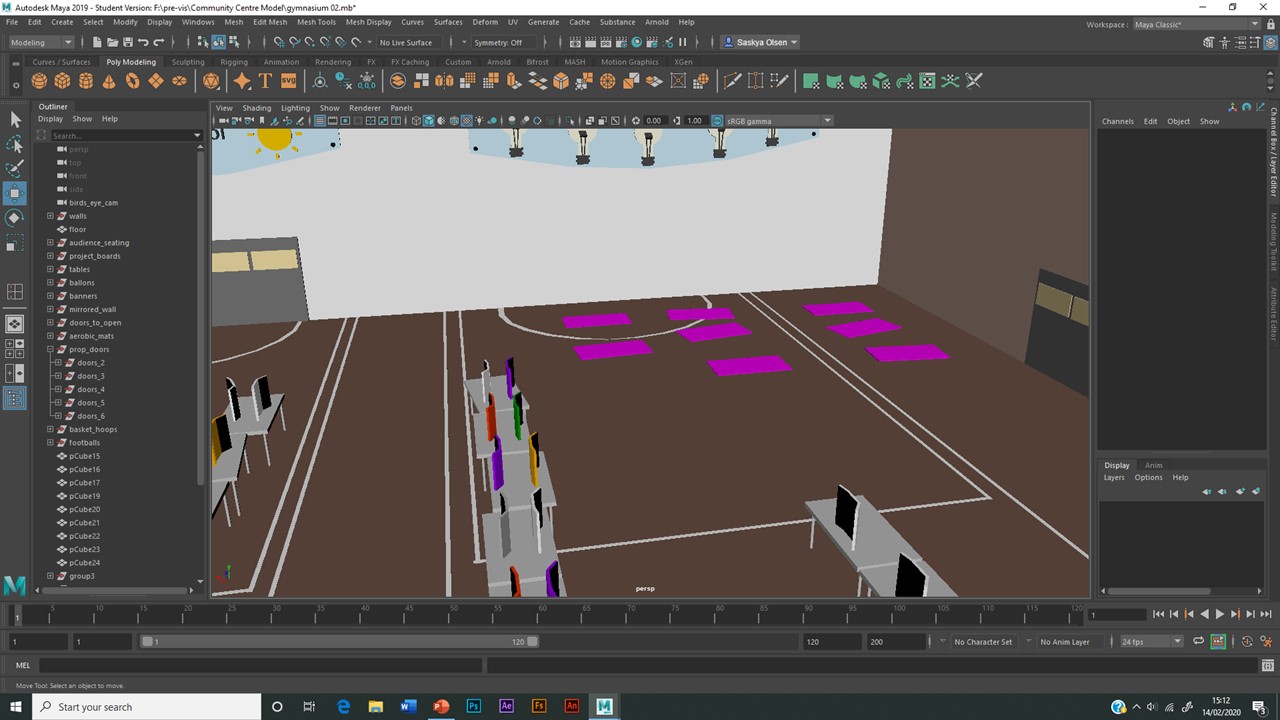
Set 7 - The Gymnasium
I knew that this was going to be an ambitious set because of its size and the number of props I will need. The space will also be filled with characters. Using my environment research to include
realistic props. The gym will include a basketball hoop.
The
essence of a ‘kids’ science fair – wonky tables. Chaos already suggested without any characters.
Accessorised the space using balloons,
and re-working the reception banner into relevant wall decorations.
I didn’t want the science fair to
drown-out the gymnasium setting, so I made the basket ball hoops more
prominent. This also makes the birds-eye shot of the gymnasium more
interesting.
I Used floor patterns to solidify the idea
of a gymnasium, then coloured the scene.
Set up the shot, and prepared for
characters. The camera will use limited movement as the scene focuses on
character movement.
I also set up an additional two cameras
in preparation for the pupil interviews. Pupil Oliver has a van der Graaff on
his project display table, an important prop to the story.
Set 7 - The Road and Fishing Lake
Using a 1x3 rectangle as reference when
building this set, as its considerably larger then the others I have created.
It is therefore harder to keep a consistent measurement of proportion.
The roadside set is joined to the lake
set, both will be divided using trees. I used the water shader tool to create a
lake, and placed some simple boats on the water surface. The sticks represent
fishing rods. This set in general will only be visible from a distance, so I
want to focus on general shape and composition rather than detail.
A simple representation of a burnt-down
building. I hope to add smoke during the editing process, to solidify the idea
of a recent fire.
To ensure that the plot of my story is
understandable, I want to include props that might help explain off-camera
events. This sign hopefully suggests that the remains in the background is in
fact the community centre.
Comments