The Pre Visualisation Process - Characters
Maybel's Entrance and Exterior
Having trouble with adjusting a
characters position, their controls seem to have a mind of their own once I
adjust their scale…
I Played around with Maya’s colour
settings once I had the characters basic movement key selected and ready. to
remove the grey background, and change it to something more immersive. A simple
sky blue.
Framed the shot with a few more trees, I
tried to improve the composition further by adding a simple path, which breaks
up the flat green plane.
I found it really challenging to
replicate a seated position with these characters, the controls take some
getting used to.
I ended up having some real trouble with
using the character’s IK Handles, I ultimately had to use very simple movement
in this scene because of the difficulties I was having. My main challenge was
trying to deal with troublesome controls; the IK Handles would move without the
characters. Objects would also mysteriously loose their textures. This was a
very time consuming shot!
Reception
Adding characters to the reception set involved creating two characters to sit behind the desk, looking busy.
I changed their clothing slightly using photoshop, making their shirts blue to match the community centre's uniform.
Below shows both receptionists in the scene, the camera pans across the desk.
It took me many hours of experimentation
to realise that I should have been moving my characters with the ‘master
control’, instead of their outliner group…
Patrick's Desk
In order to begin scenes involving
Patrick’s office, I needed a modelled character. I wanted to spend a little
time editing his appearance to show his significance to the story.
Created some minor adjustments to the
pre-made texture for the modelled character. The clothing now resembles
Maybel’s community centre uniform.
I think that my ambitious idea to have
Patrick doing origami is a little to tricky to show through pre-vis. I
therefore decided to replace this origami with a book.
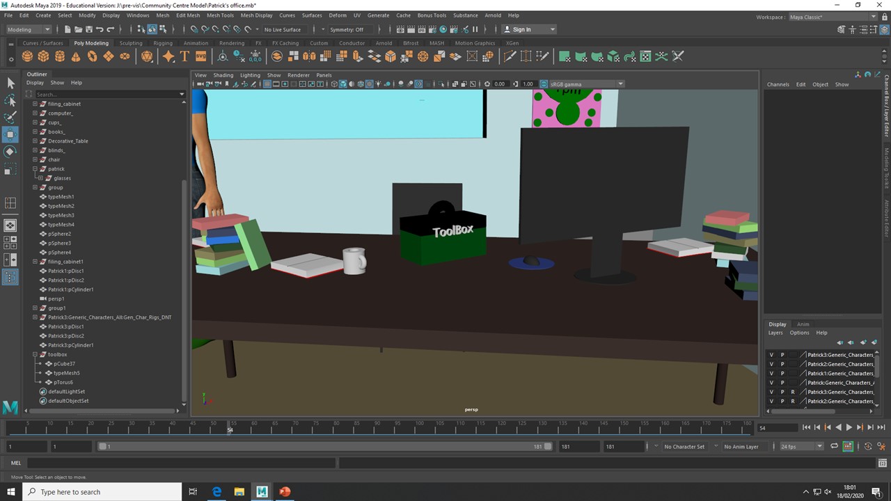
The camera then pans across his desk to
reveal the mess.
I changed the previous scene last minute...Instead of having Patrick reading a book,
I decided have my character completing a different action, something that
suggests has lazy personality clearer. In the new scene, Patrick is seen
playing Tetris and ignoring the ringing phone seen in the foreground.
This scene in particular is very
underwhelming in CG, as it focuses on facial expression. Therefore, the shots
are static and boring, with little happening…
I modelled a quick toolbox for
Patrick to bring to the table, a simple cube and torus for a handle.
I wasn’t satisfied with the fishing
toolbox I initially modelled; the outcome was very simple and rushed as I was
pressed for time. I revisited this prop and improved its appearance. I found
this necessary because of how important the prop is to the main character,
Patrick.
The Art Exhibition
This scene is short, but needs to
communicate an argument. I found it easier to suggest a passive posture for
Patrick and an angrier pose for the secondary character. The contrasting poses
make this shot easier to understand in Pre-vis.
The Gymnasium
The gymnasium scene involves an immense
number of characters, ideally more than what is shown. I decided to shrink the
pre-set characters to the height of a primary schooler, and created simple
floating movements to suggest a crowd in motion.
Props will hopefully clarify the simple
movements of my characters. The ‘yoga’ mats and future boom box will suggest
that these characters are doing aerobics.
The Burnt Ruins
When creating camera and character
movement, I kept composition in mind. Along with this, I felt that continuity
and accurate flow was important. Hopefully, my camera movements will feel
natural and handheld.


Comments